Today’s R tip
Below, we demonstrate the use of label_date_short() from the scales package, which will automatically print efficient date labels in your ggplot.
Load packages
Today we load the following R packages. As explained in the Epi R Handbook, we emphasize p_load() from pacman, which installs the package if necessary and loads it for use. You can also load installed packages with library() from base R.
pacman::p_load(
  here,     # relative filepaths
  rio,      # import/export data
  scales,   # helper functions for ggplot scales
  tidyverse # data management and visualization
  )
Import data
Here we import the cleaned dataset (an .rds file), which you can download from the Epi R Handbook here.
linelist <- import("linelist_cleaned.rds")Default date labels
Below, we create a weekly epidemic curve with the default date axis labels. They are sufficient, but not terribly exciting and not necessarily at the intervals that we want.
ggplot(
  data = linelist,
  mapping = aes(x = date_onset))+
  geom_histogram()+
  theme_classic(16)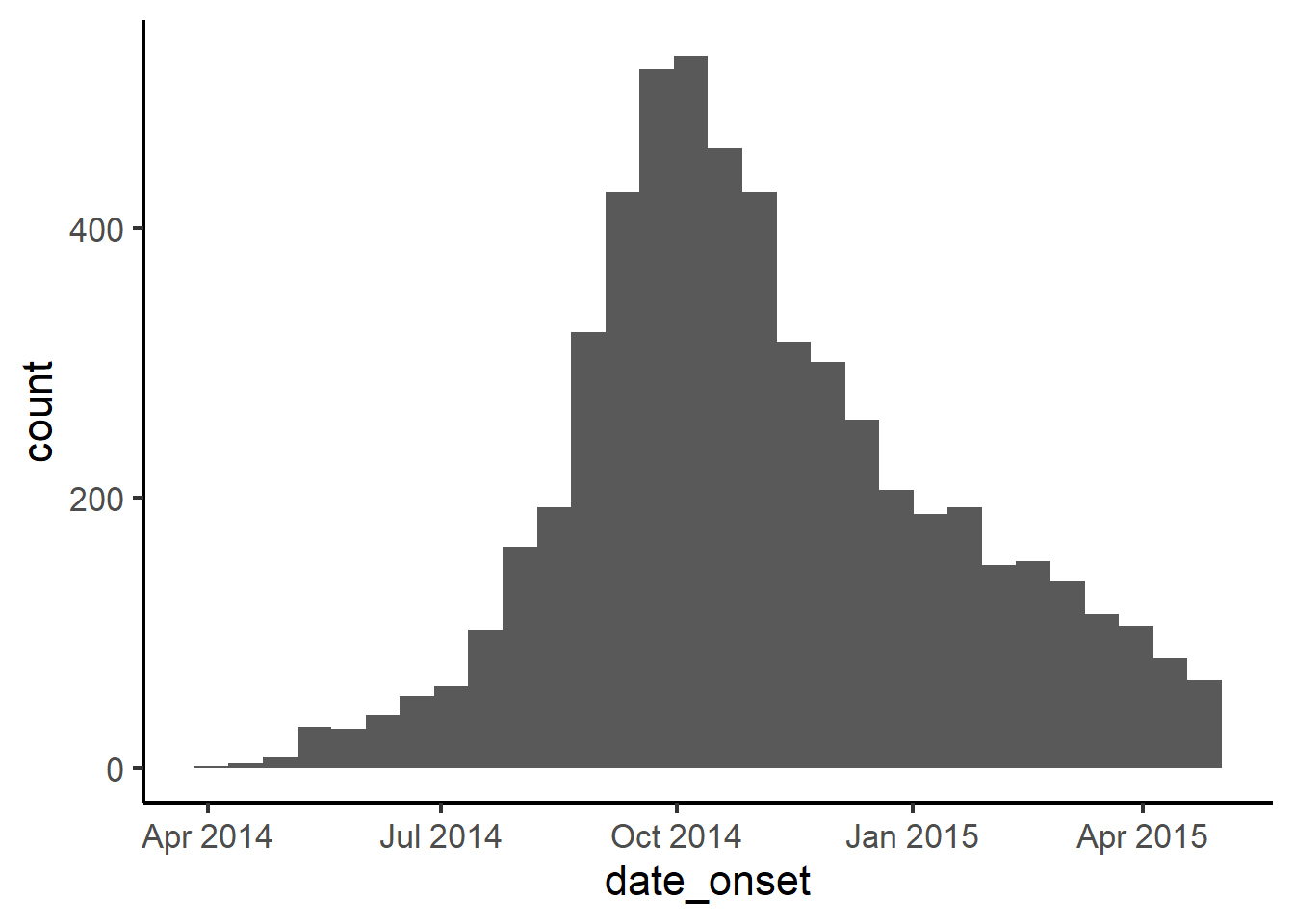
The classic approach to adjusting date labels
It is relatively easy to adjust the appearance and interval of date labels, using the scale_x_date() function added with a + to the original ggplot.
The date_breaks = argument accepts values like “months”, “weeks”, “days”, “2 months”, etc. See a complete explanation in the Epi R Handbook’s Working with Dates page).
The date_labels = argument can accept strptime syntax, which is also explained in the Epi R Handbook. This syntax, within quotes, consists of placeholders for date elements like year, month, and day. For example, “%d” would display the date as the number 1-31 of the given month. Likewise, “%Y” is a 4-digit year, and “%y” is a 2-digit year. Characters in between these placeholders can include spaces, commas, parentheses, etc, even “/n” which puts the following output on a newline.
Below as an example, we add scale_x_date() to the ggplot. We specify the interval of date labels to be “months”, and adjust the date_labels = to display the day, month, and 4-digit year.
While this allows detailed control over the display, the output is now inefficient, showing the year repeated unnecessarily and distracting from the plot itself.
ggplot(
  data = linelist,
  mapping = aes(x = date_onset))+
  geom_histogram()+
  scale_x_date(
    date_breaks = "months",
    date_labels = "%d\n%b\n%Y")+
  theme_classic(16)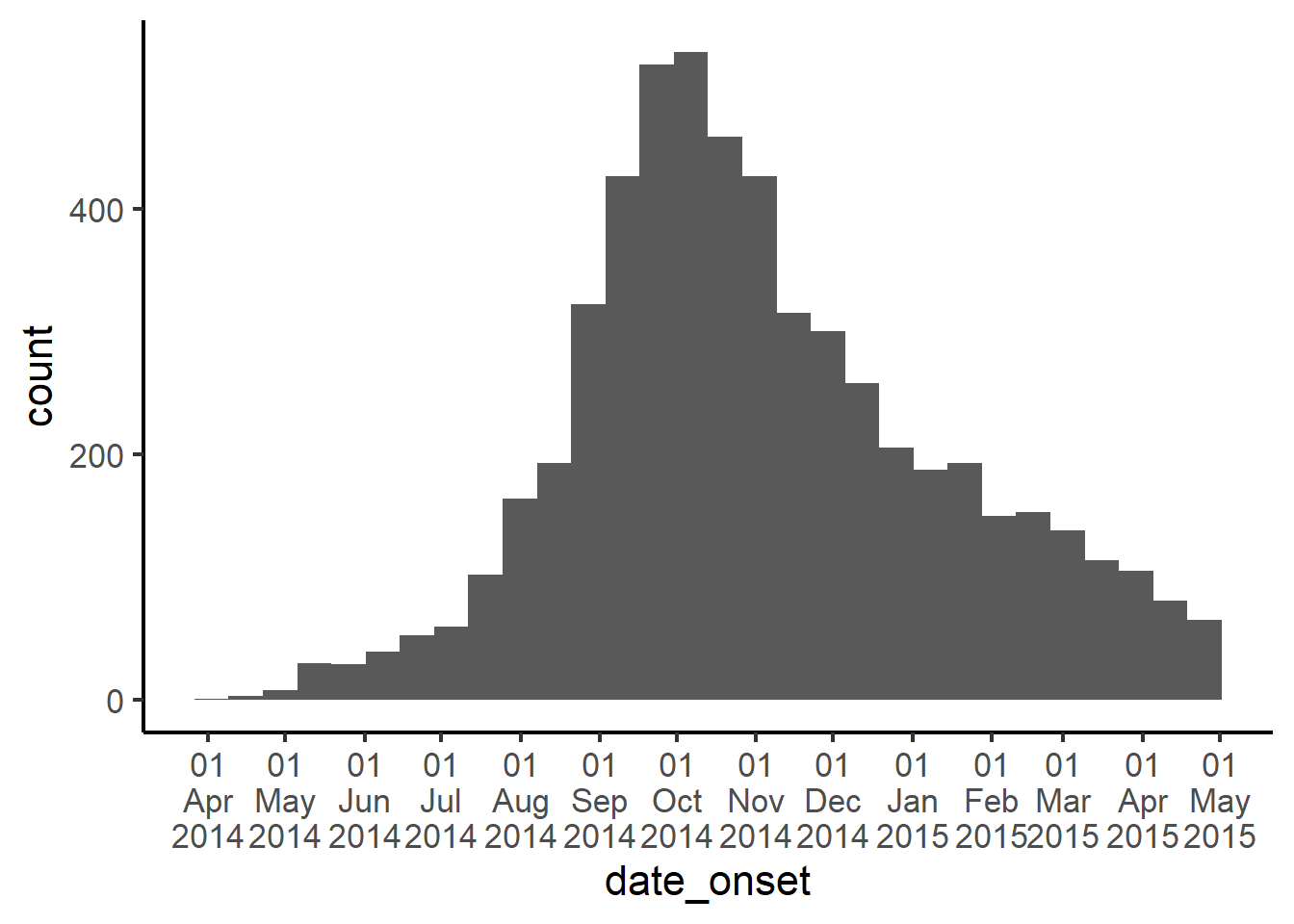
Using label_date_short() from the scales package
Another approach is to use the label_date_short() function from the scales package.
In this approach, we still add scale_x_date() to the ggplot, but instead of working within a date_labels = argument, we use the argument labels =. To this argument, we assign the function label_date_short() from the package scales (note the empty parentheses included at the end of the function).
Now, the date labels will be automatically adjusted to show the minimal amount of information necessary to uniquely identify each label. You can still use the date_breaks = argument to adjust the frequency.
ggplot(
  data = linelist,
  mapping = aes(x = date_onset))+
  geom_histogram()+
  scale_x_date(
    date_breaks = "months",
    labels = scales::label_date_short())+
  theme_classic(16)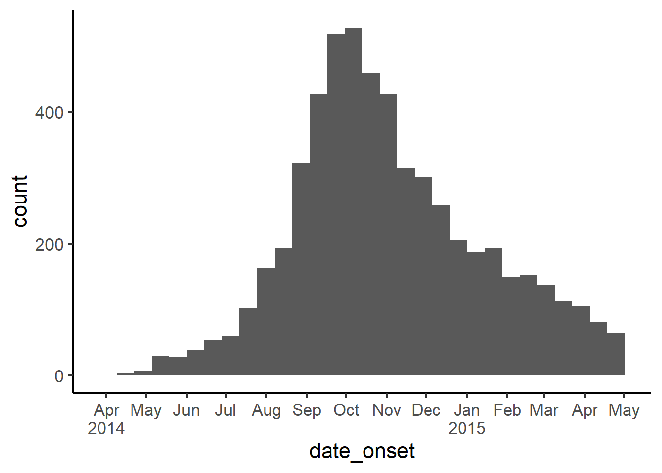
And below specifying labels to display every two months.
ggplot(
  data = linelist,
  mapping = aes(x = date_onset))+
  geom_histogram()+
  scale_x_date(
    date_breaks = "2 months",
    labels = scales::label_date_short())+
  theme_classic(16)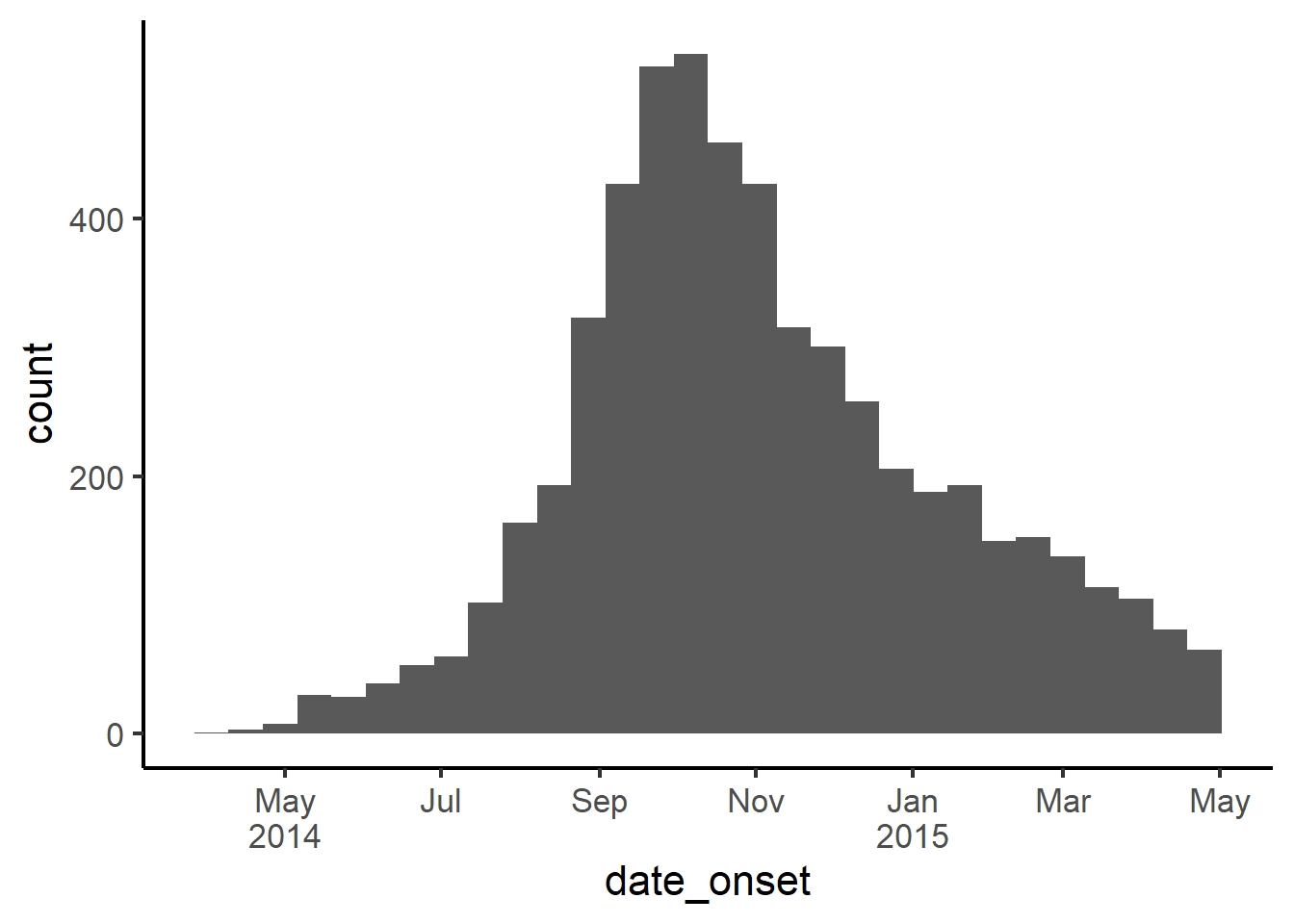
There is an extra benefit of using this approach - if you do not specify the interval (date_breaks =), then as your outbreak grows in duration the x-axis date labels will automatically adjust from days, to weeks, months, and even years. This is very convenient for automated reports in the early stages of an outbreak!